.jpg)
Creating aesthetically beautiful and user-friendly interfaces is critical in today’s web development world. While checkboxes and radio inputs are necessary for gathering user input, their default design might be boring and unappealing.
Fortunately, with the power of custom CSS, you can change these mundane inputs into eye-catching and personalized pieces that match the aesthetics of your website.
This article will walk you through the process of using CSS to customize checkbox and radio inputs. We’ll look at many strategies and characteristics that will allow you to customize these inputs to meet your design needs.
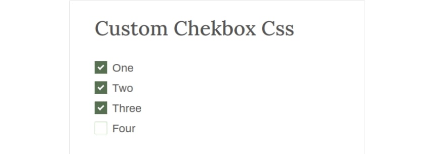
Create Custom Checkbox with Html And CSS
<div class="cxc-main-warap">
		<h2>Custom Chekbox Css</h2>
		<form class="cxc-checkbox-form" method="POST" action="">
			<label class="cxc-checkbox">One
				<input type="checkbox" checked="checked">
				<span class="cxc-check"></span>
			</label>
			<label class="cxc-checkbox">Two
				<input type="checkbox">
				<span class="cxc-check"></span>
			</label>
			<label class="cxc-checkbox">Three
				<input type="checkbox">
				<span class="cxc-check"></span>
			</label>
			<label class="cxc-checkbox">Four
				<input type="checkbox">
				<span class="cxc-check"></span>
			</label>
		</form>
	</div>
Also read: How To Create a Scroll Back To Top Button using jQuery
<style type="text/css">
.cxc-checkbox {
display: block;
position: relative;
padding-left: 35px;
margin-bottom: 12px;
cursor: pointer;
font-size: 22px;
-webkit-user-select: none;
-moz-user-select: none;
-ms-user-select: none;
user-select: none;
}
.cxc-checkbox input {
position: absolute;
opacity: 0;
cursor: pointer;
}
.cxc-check {
position: absolute;
top: 0;
left: 0;
height: 25px;
width: 25px;
background-color: #a9c79f00;
border: 1px solid #abc9a1;
}
.cxc-checkbox:hover input ~ .cxc-check {
border: 2px solid #abc9a1;
}
.cxc-checkbox input:checked ~ .cxc-check {
background-color: #587052;
border:none;
}
.cxc-check:after {
content: "";
position: absolute;
display: none;
}
.cxc-checkbox input:checked ~ .cxc-check:after {
display: block;
}
.cxc-checkbox .cxc-check:after {
left: 9px;
top: 5px;
width: 7px;
height: 12px;
border: solid white;
border-width: 0 3px 3px 0;
-webkit-transform: rotate(45deg);
-ms-transform: rotate(45deg);
transform: rotate(45deg);
}
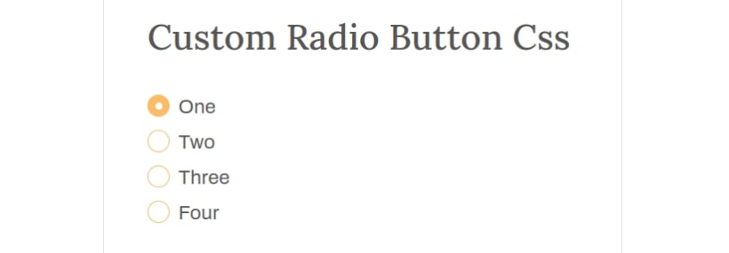
</style>Create Custom Radio button Checkbox Html And CSS
<div class="cxc-main-warap">
		<h2>Custom Radio Button Css</h2>
		<form class="cxc-checkbox-form" method="POST" action="">
			<label class="cxc-radio">One
				<input type="radio" checked="checked" name="cxc-radio">
				<span class="cxc-check"></span>
			</label>
			<label class="cxc-radio">Two
				<input type="radio" name="cxc-radio">
				<span class="cxc-check"></span>
			</label>
			<label class="cxc-radio">Three
				<input type="radio" name="cxc-radio">
				<span class="cxc-check"></span>
			</label>
			<label class="cxc-radio">Four
				<input type="radio" name="cxc-radio">
				<span class="cxc-check"></span>
			</label>
		</form>
	</div>
Also Read: How To Build Tabs with CSS, HTML, and jQuery
<style type="text/css">
		.cxc-radio {
			display: block;
			position: relative;
			padding-left: 35px;
			margin-bottom: 12px;
			cursor: pointer;
			font-size: 22px;
			-webkit-user-select: none;
			-moz-user-select: none;
			-ms-user-select: none;
			user-select: none;
		}


		.cxc-radio input {
			position: absolute;
			opacity: 0;
			cursor: pointer;
		}
		.cxc-radio .cxc-check {
			position: absolute;
			top: 0;
			left: 0;
			height: 25px;
			width: 25px;
			background-color: #ffbc6600;
			border: 1px solid #ffbc66;
			border-radius: 50%;
		}
		.cxc-radio:hover input ~ .cxc-check {
			border: 2px solid #ffbc66;
		}
		.cxc-radio input:checked ~ .cxc-check {
			background-color: #ffbc66;
			border:none;
		}
		.cxc-radio .cxc-check:after {
			content: "";
			position: absolute;
			display: none;
		}
		.cxc-radio input:checked ~ .cxc-check:after {
			display: block;
		}
		.cxc-radio .cxc-check:after {
			top: 9px;
			left: 9px;
			width: 8px;
			height: 8px;
			border-radius: 50%;
			background: white;
		}
	</style>
Using custom CSS to customize checkbox and radio inputs provides an excellent chance to improve the aesthetic appeal and user experience of your online forms. Using the techniques and characteristics mentioned in this lesson, you can easily change these inputs into personalized pieces that blend in with the style of your website.
By expanding your CSS skills to include checkbox and radio input customization, you can create visually cohesive and engaging web forms that leave a lasting impression on your users.
FAQs:
Can I customize checkbox and radio inputs without using CSS?
While CSS is the most common and flexible method for customizing checkbox and radio inputs, there are alternative approaches. Some JavaScript libraries, like Bootstrap and Material-UI, provide pre-styled checkbox and radio input components that can be easily customized.
Are there any limitations to customizing checkbox and radio inputs?
Customizing checkbox and radio inputs through CSS has its limitations. It’s important to consider browser compatibility and the potential for inconsistency across different platforms. Additionally, extreme customization might compromise the accessibility of these inputs, so it’s crucial to test and ensure they remain usable for all users.
How can I make my customized checkbox and radio inputs accessible?
To maintain accessibility, ensure that your customized checkbox and radio inputs have clear visual cues, provide text alternatives or labels, and maintain keyboard focusability. Use proper HTML markup and consider using ARIA attributes to enhance accessibility.
Can I use custom icons for checkbox and radio inputs?
Yes, you can use custom icons for checkbox and radio inputs. You can achieve this by hiding the default input and styling a label element with a background image or an inline SVG.