.jpg)
we will guide you through the process of creating a toggle switch using HTML and CSS. Toggle switches are commonly used in web development to provide users with a convenient way to turn on or off certain features or options.
By the end of this tutorial, you will have a solid understanding of how to create a stylish and functional toggle switch that you can incorporate into your own web projects. So, let’s get started!
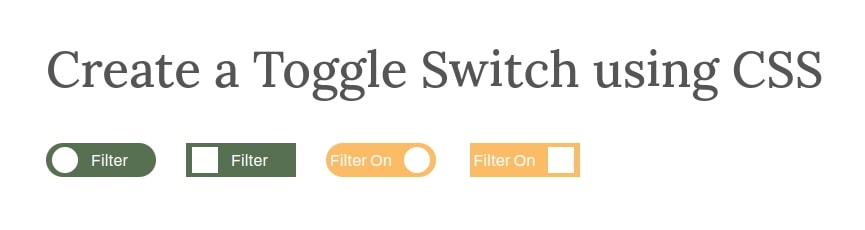
Custom Switch Html And Css
To begin, let’s set up the basic HTML structure for our toggle switch.
<div class="cxc-main-warap">
		<label class="cxc-switch-btn">
			<input type="checkbox">
			<div class="cxc-slide cxc-round">Filter On</div>
		</label>

		<label class="cxc-switch-btn">
			<input type="checkbox">
			<div class="cxc-slide">Filter On</div>
		</label>
	</div>
Custom Switch Html And Css With Rounded Style Toggle Switch
Now that we have the basic HTML structure in place, it’s time to add some CSS styles to make our toggle switch visually appealing. We will use CSS to customize the appearance of the switch in both its on and off states, as well as add smooth transition effects when the switch is toggled.
<style type="text/css">
		.cxc-switch-btn {
			position: relative;
			display: inline-block;
			width: 110px;
			height: 34px;
		}
		.cxc-switch-btn input {display:none;}
		.cxc-slide {
			position: absolute;
			cursor: pointer;
			top: 0;
			left: 0;
			right: 0;
			bottom: 0;
			background-color: #ffbc66;
			-webkit-transition: .4s;
			transition: .4s;
			padding: 4px;
			color: #fff;
		}
		.cxc-slide:before {
			position: absolute;
			content: "";
			height: 26px;
			width: 26px;
			left: 78px;
			bottom: 4px;
			background-color: white;
			-webkit-transition: .4s;
			transition: .4s;
		}


		input:checked + .cxc-slide {
			background-color: #587052;
			padding-left: 45px;
		}
		input:focus + .cxc-slide {
			box-shadow: 0 0 1px #01aeed;
		}
		input:checked + .cxc-slide:before {
			-webkit-transform: translateX(26px);
			-ms-transform: translateX(26px);
			transform: translateX(26px);
			left: -20px;
		}

		/* Round Style Start  */
		.cxc-slide.cxc-round {
			border-radius: 34px;
		}
		.cxc-slide.cxc-round:before {
			border-radius: 50%;
		}
		/* Round Style End  */

	</style>
Conclusion
In this blog post, we have covered the step-by-step process of creating a toggle switch using HTML and CSS. By following the instructions provided, you should now have a fully functional toggle switch that you can use in your web projects.