.jpg)
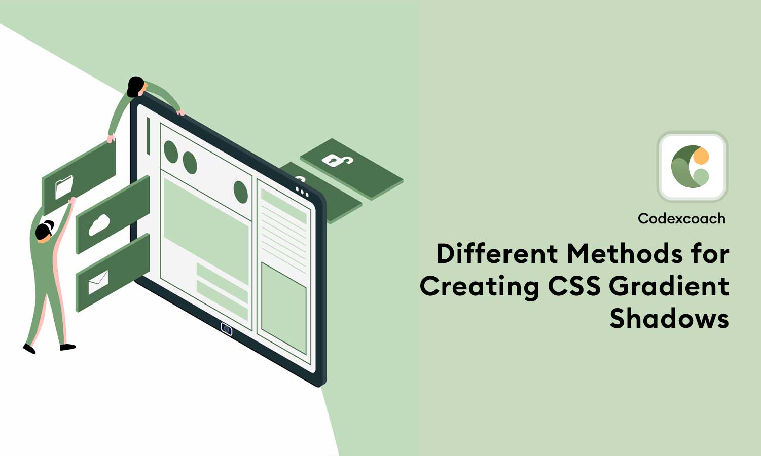
CSS gradients can be a great way to add depth and dimension to your website designs, and gradient shadows take this to the next level. Gradient shadows can be used to create a wide variety of effects, from subtle depth to dramatic, eye-catching visuals.
One popular method is to use the CSS box-shadow property, which allows you to apply a shadow effect to any HTML element. By combining box-shadow with CSS gradients, you can create complex and dynamic shadow effects.
Different methods for creating CSS gradient
There are several different methods for creating CSS gradient shadows, each with its own advantages and disadvantages.
- Non-transparent solution
- Transparent solution
- Adding a border-radius
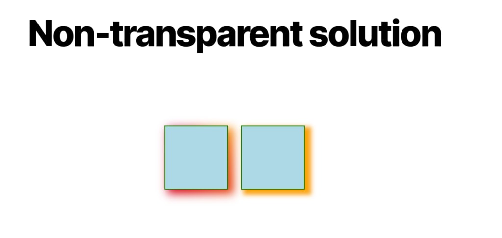
1 : Non-transparent solution
.cxc-box {
  position: relative;
}
.cxc-box::before {
  content: "";
  position: absolute;
  inset: -5px; /* control the spread */
  transform: translate(10px, 8px); /* control the offsets */
  z-index: -1; /* place the element behind */
  background: /* your gradient here */ ;
  filter: blur(10px); /* control the blur */
}
box-shadow: 10px 8px 10px 5px orange;Here’s an example of a gradient shadow adjacent to a traditional box-shadow:
<div class="cxc-grid">
		<div class="cxc-box cxc-shadow"></div>
		<div class="cxc-box cxc-basic"></div>
</div>
.cxc-grid {
margin: 0;
display: grid;
place-content: center;
grid-auto-flow: column;
gap: 30px;
}
.cxc-box {
width: 150px;
height: 150px;
border: 2px solid green;
background: lightblue;
position: relative;
}
.cxc-basic {
box-shadow: 10px 8px 10px 5px orange;
}
.cxc-shadow:before {
content: "";
position: absolute;
inset: -5px;
transform: translate(10px, 8px);
z-index: -1;
background: conic-gradient(from 90deg at 40% -25%, #ffd700, #f79d03, #ee6907, #e6390a, #de0d0d, #d61039, #cf1261, #c71585, #cf1261, #d61039, #de0d0d, #ee6907, #f79d03, #ffd700, #ffd700, #ffd700);
filter: blur(10px);
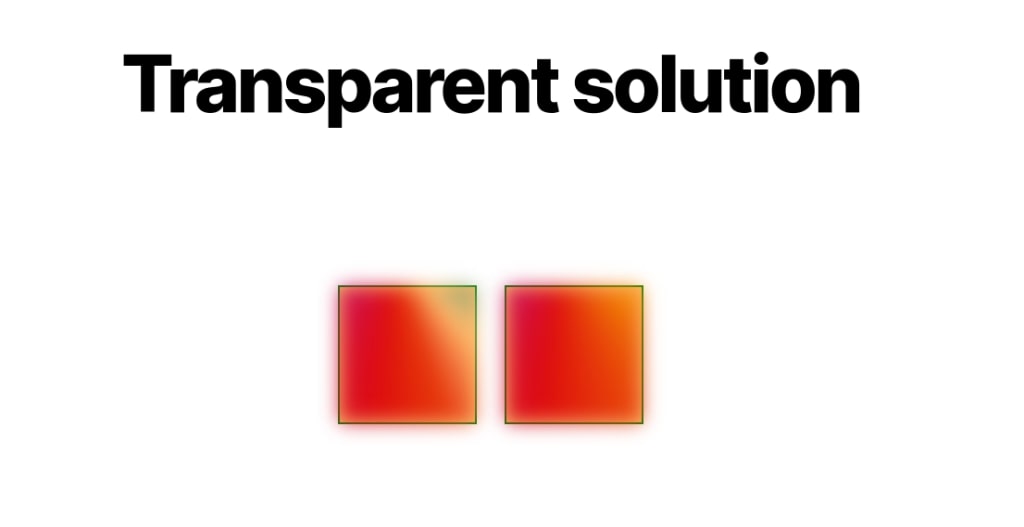
}2 : Transparent solution
<div class="cxc-grid">
		<div class="cxc-box cxc-shadow"></div>
		<div class="cxc-box cxc-basic"></div>
</div>
.cxc-grid {
margin: 0;
display: grid;
place-content: center;
grid-auto-flow: column;
gap: 30px;
}
.cxc-box {
width: 150px;
height: 150px;
border: 2px solid green;
background: #ffbe6e;
position: relative;
}
.cxc-basic:before {
content: "";
position: absolute;
inset: 0;
transform: translate3d(0, 0, -1px);
background: conic-gradient(from 90deg at 40% -25%, #ffd700, #f79d03, #ee6907, #e6390a, #de0d0d, #d61039, #cf1261, #c71585, #cf1261, #d61039, #de0d0d, #ee6907, #f79d03, #ffd700, #ffd700, #ffd700);
filter: blur(10px);
}
.cxc-shadow:before {
content: "";
position: absolute;
inset: 0;
transform: translate3d(0, 0, -1px);
background: conic-gradient(from 90deg at 40% -25%, #4e6f45, #84a375, #ffbe6e, #e6390a, #de0d0d, #d61039, #cf1261, #c71585, #cf1261, #d61039, #de0d0d, #ffbe6e, #84a375, #4e6f45, #4e6f45, #4e6f45);
filter: blur(10px);
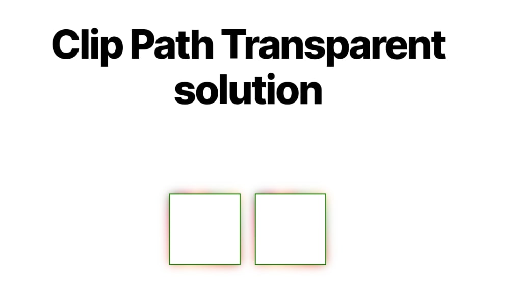
}There is no method to achieve it, however, we can replicate it using a certain polygon pattern:
clip-path: polygon(-100vmax -100vmax,100vmax -100vmax,100vmax 100vmax,-100vmax 100vmax,-100vmax -100vmax,0 0,0 100%,100% 100%,100% 0,0 0).cxc-grid {
margin: 0;
display: grid;
place-content: center;
grid-auto-flow: column;
gap: 30px;
}
.cxc-box {
width: 150px;
height: 150px;
border: 2px solid green;
position: relative;
transform: translate(0);
transform-style: preserve-3d;
}
.cxc-basic:before {
content: "";
position: absolute;
inset: 0;
transform: translate3d(0, 0, -1px);
background: conic-gradient(from 90deg at 40% -25%, #4e6f45, #ffbe6e, #84a375, #e6390a, #ffbe6e, #d61039, #4e6f45, #c71585, #4e6f45, #d61039, #ffbe6e, #84a375, #ffbe6e, #4e6f45, #4e6f45, #4e6f45);
filter: blur(10px);
clip-path: polygon(-100vmax -100vmax, 100vmax -100vmax, 100vmax 100vmax, -100vmax 100vmax, -100vmax -100vmax, 0 0, 0 100%, 100% 100%, 100% 0, 0 0); // Add clip path
}
.cxc-shadow:before {
content: "";
position: absolute;
inset: 0;
transform: translate3d(0, 0, -1px);
background: conic-gradient(from 90deg at 40% -25%, #4e6f45, #ffbe6e, #84a375, #e6390a, #ffbe6e, #d61039, #4e6f45, #c71585, #4e6f45, #d61039, #ffbe6e, #84a375, #ffbe6e, #4e6f45, #4e6f45, #4e6f45);
filter: blur(10px);
clip-path: polygon(-100vmax -100vmax, 100vmax -100vmax, 100vmax 100vmax, -100vmax 100vmax, -100vmax -100vmax, 0 0, 0 100%, 100% 100%, 100% 0, 0 0); // Add clip path
}
.cxc-grid {
margin: 0;
display: grid;
place-content: center;
grid-auto-flow: column;
gap: 30px;
}
.cxc-box {
width: 150px;
height: 150px;
border: 2px solid green;
position: relative;
transform: translate(0);
transform-style: preserve-3d;
}
.cxc-basic:before {
content: "";
position: absolute;
inset: -10px; // Add -10px Inset
transform: translate3d(0, 0, -1px);
background: conic-gradient(from 90deg at 40% -25%, #84a375, #ffbe6e, #4e6f45, #e6390a, #84a375, #d61039, #cf1261, #c71585, #cf1261, #d61039, #84a375, #4e6f45, #ffbe6e, #84a375, #84a375, #84a375);
filter: blur(10px);
clip-path: polygon(-100vmax -100vmax, 100vmax -100vmax, 100vmax 100vmax, -100vmax 100vmax, -100vmax -100vmax, 0 0, 0 100%, 100% 100%, 100% 0, 0 0);
}
.cxc-shadow:before {
content: "";
position: absolute;
inset: -10px; // Add -10px Inset
transform: translate3d(0, 0, -1px);
background: conic-gradient(from 90deg at 40% -25%, #84a375, #ffbe6e, #4e6f45, #e6390a, #84a375, #d61039, #cf1261, #c71585, #cf1261, #d61039, #84a375, #4e6f45, #ffbe6e, #84a375, #84a375, #84a375);
filter: blur(10px);
clip-path: polygon(-100vmax -100vmax, 100vmax -100vmax, 100vmax 100vmax, -100vmax 100vmax, -100vmax -100vmax, 0 0, 0 100%, 100% 100%, 100% 0, 0 0);
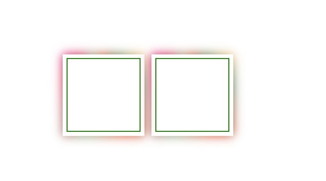
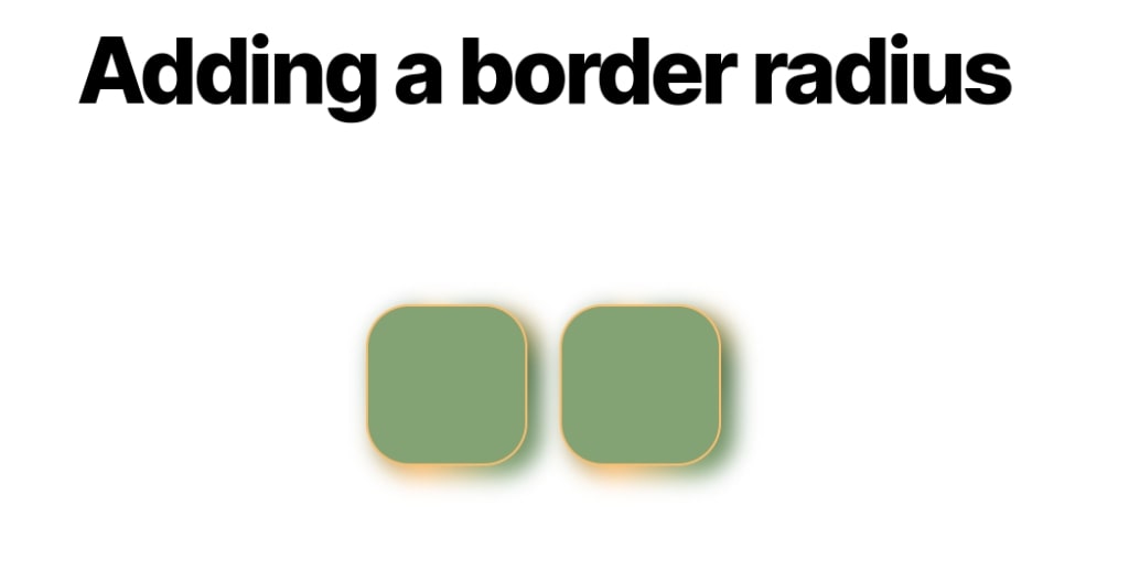
}3 : Adding A Border Radius
<div class="cxc-grid">
		<div class="cxc-box cxc-shadow"></div>
		<div class="cxc-box cxc-basic"></div>
</div>
.cxc-grid {
margin: 0;
display: grid;
place-content: center;
grid-auto-flow: column;
gap: 30px;
}
.cxc-box {
width: 150px;
height: 150px;
border: 2px solid #ffbe6e;
background: #84a375;
border-radius: 40px;
position: relative;
transform: translate(0);
transform-style: preserve-3d;
}
.cxc-basic:before {
content: "";
position: absolute;
inset: -5px;
transform: translate3d(10px, 8px, -1px);
background: conic-gradient(from 90deg at 40% -25%, #84a375, #ffbe6e, #4e6f45, #84a375, #ffbe6e, #4e6f45, #84a375, #c71585, #84a375, #4e6f45, #ffbe6e, #4e6f45, #ffbe6e, #84a375, #84a375, #84a375);
filter: blur(10px);
border-radius: inherit;
}
.cxc-shadow:before {
content: "";
position: absolute;
inset: -5px;
transform: translate3d(10px, 8px, -1px);
background: conic-gradient(from 90deg at 40% -25%, #84a375, #ffbe6e, #4e6f45, #84a375, #ffbe6e, #4e6f45, #84a375, #c71585, #84a375, #4e6f45, #ffbe6e, #4e6f45, #ffbe6e, #84a375, #84a375, #84a375);
filter: blur(10px);
border-radius: inherit;
}By understanding these different methods for creating CSS gradient shadows, you can choose the approach that best suits your design goals and technical expertise. Whether you’re looking to add subtle depth or create bold and dramatic effects, gradient shadows can be a powerful tool for enhancing your website designs.
