.jpg)
I hope you found this guide on generating a custom shortcode for your WordPress website useful. If so, I invite you to subscribe to Elegant Themes, since we have some fantastic stuff on the way.
Also, I remind you to back up any files before editing them.
To summarize, we will utilize CSS and jQuery to do this. But don’t worry if you’re afraid of programming; everything is explained and supplied below.
In summary, the CSS below styles the real mobile expand/collapse icons, while jQuery handles the actual expand/collapse function.
How do I use code?
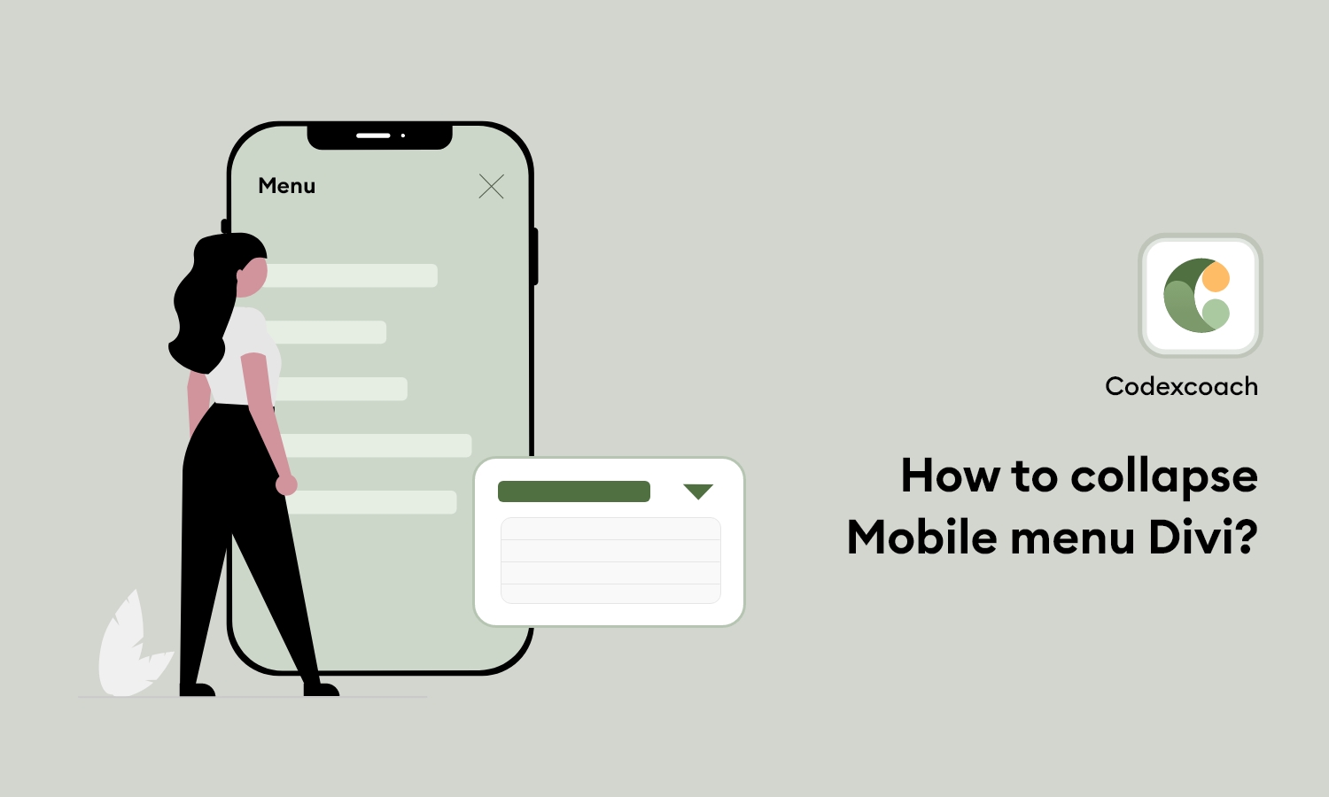
Right now, Divi is not providing a collapsing effect for the mobile menu. So when we have many items, it’s hard to manage the menu on mobile. It’s a great way to customize the Divi mobile menu using CSS and jQuery. You have to put the following code in your CSS and JS files.
Put the following wp_footer action in the Function.php file.
<?php
add_action( 'wp_footer', 'cxc_add_mobile_menu_collapse_script' );
function cxc_add_mobile_menu_collapse_script(){
	?>
	<script type="text/javascript">
		(function($) {
			function wc_mobile_collaps_menu() {
        		// mobile menu
        		$('#mobile_menu .menu-item-has-children > a').after('<span class="menu-closed"></span>');
        		$('#mobile_menu .menu-item-has-children > a').each(function() {
        			$(this).next().next('.sub-menu').toggleClass('hide',1000);
        		});
        		$('#mobile_menu .menu-item-has-children > a + span').on('click', function(event) {
        			event.preventDefault();
        			$(this).toggleClass('menu-open');
        			$(this).next('.sub-menu').toggleClass('hide',1000);
        		});
        	}

        	$(window).load(function() {
        		setTimeout(function() {
        			wc_mobile_collaps_menu();
        		}, 700);
        	});

        })(jQuery);
    </script>
    <?php
}
?>
And put this wp_head on any CSS file.
<?php
add_action( 'wp_head', 'cxc_add_mobile_menu_collapse_style' );
function cxc_add_mobile_menu_collapse_style(){
	?>
	<style>
		/* Divi Mobile Menu Collapse CSS Start */

		/* hide sub menu on mobile */
		#main-header .et_mobile_menu li ul.hide {
			display: none !important;
		}

		/* This for parent menu item */
		#mobile_menu .menu-item-has-children {
			position: relative;
		}
		#mobile_menu .menu-item-has-children > a {
			background: transparent;
		}

		/* For set icon on right side of parent menu */
		#mobile_menu .menu-item-has-children > a + span {
			position: absolute;
			right: 0;
			top: 0;
			padding: 10px 20px;
			font-size: 20px;
			font-weight: 700;
			cursor: pointer;
			z-index: 3;
		}

		/* For icon swap */
		span.menu-closed:before {
			content: "\4c";
			display: block;
			color: inherit;
			font-size: 16px;
			font-family: ETmodules;
		}
		span.menu-closed.menu-open:before {
			content: "\4d";
		}
	</style>
	<?php
}
?>
I hope you’ve learned How To Collapse Divi Mobile Menu. Please leave your comments in the section below. If you find this sort of post useful, please subscribe since we have a tonne of tutorials in the works that will be uploaded soon!