.jpg)
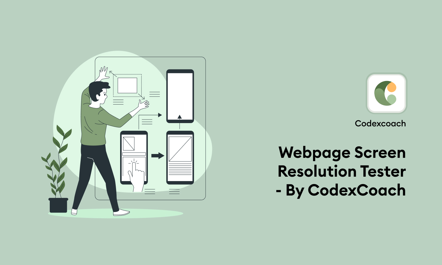
What is a webpage screen resolution tester, and how does it work?
The most precise and user-friendly web page screen resolution tester is offered by CodexCoach! You can assess your website across a range of platforms and screen resolutions by using this fantastic tool.
This application was developed to give users a tool for accurately and responsively testing website resolution when examining pages with various screens. It is available in a variety of sizes and can be viewed on a variety of devices, including smartphones, tablets, PCs, and computers.
What is Web Page Screen Resolution Simulator?
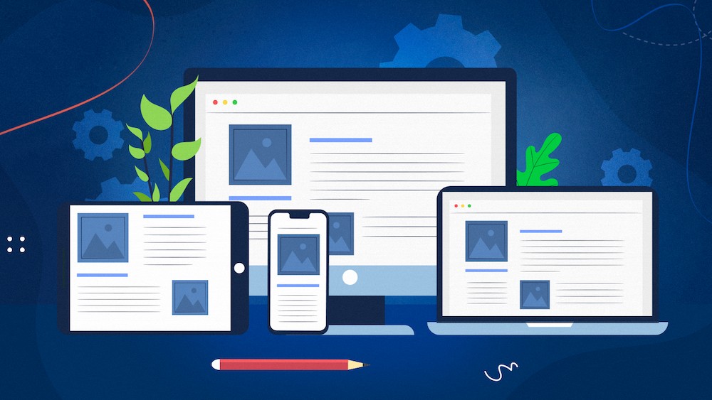
Viewers can examine websites in various resolutions or formats with online web page screen resolution testers. Codexcoach is the provider of this mobile web page design tester utility. It is one of the most effective tools that many website proprietors use to change the screen resolution of their website so that it will be consistent across all platforms.
Because it reflects how well your website is designed and makes it more attractive to users, the screen resolution of your web pages is crucial to how well your website is presented.
How Does Web Page Screen Resolution Simulator Work?
Copy and paste the URL of your website into the box provided at this link:
https://codexcoach.com/tools/webpage-screen-resolution-tester/
to use our responsive website checker. The online screen resolution simulator will open your website after you choose the resolution type you want to view and click the “Check” button.
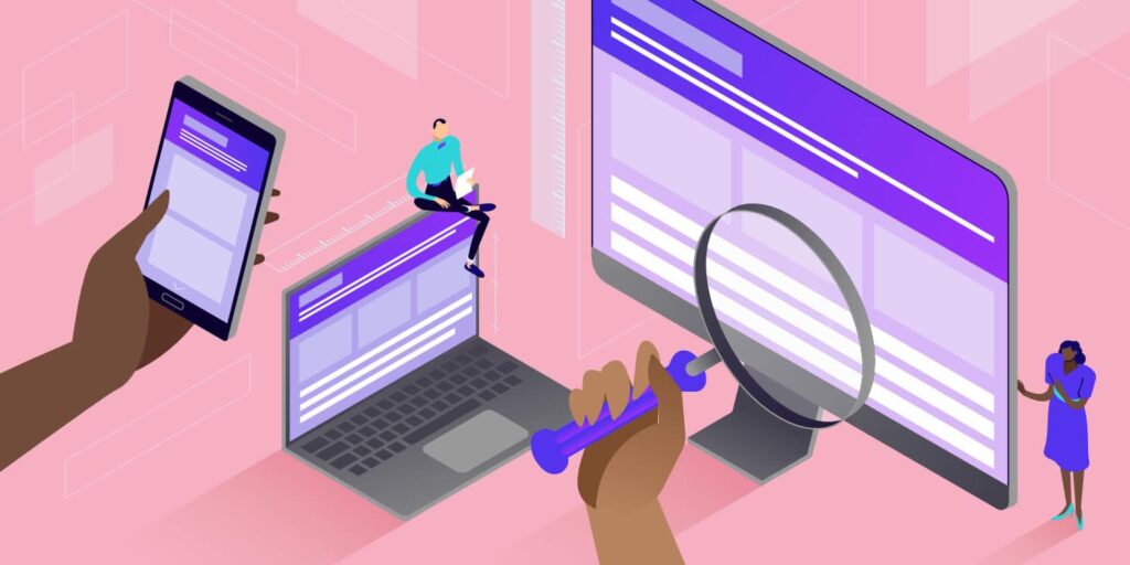
It allows you to check the text, graphics, and layout of your website across a range of screen resolutions. You receive the results right away, super quickly and simply!
You can be sure that this screen display simulator application is the most cutting-edge one yet. It will be useful to all website owners who want to view their site in different resolutions and make a few changes to make it look better from all angles!
The only tool you require to thoroughly evaluate your website across various screen sizes is this universal web design tester.
This is helpful when using a mobile website because mobile phones and iPads typically display websites in full-screen mode. Smartphone and tablet resolutions match the height of those in the computer viewport. You can completely display sites in your browser using a tool. It can also be used to assess different websites that are on your local device or internal network.

Why should you use a free online screen resolution simulator to evaluate your website?
Because this utility can verify web page screen resolution for PCs, tablets, laptops, smartphones, and even televisions, you can always try your website’s operation using various formats.
Copy/paste your web page URL into the given area, select the screen size you’d like to test, and press “Check” to use a responsive website checker and web page screen resolution tester. You will be redirected to another website for the outcome. This is incredibly helpful when examining the specifications of tablets and mobile phones.
Conclusion
The ability of this tool to let users like you make fast changes to your website’s design makes it the most effective and adaptable website checker you can find online.
These adjustments can improve your website’s appearance on various screen sizes and increase site traffic. Most people currently visiting websites do so on their cell phones and devices. Because of this, administrators should regularly verify the webpage screen resolution tester of their websites on mobile devices.
